Landing Page Design | Dental Insurance Online Enrollment
The Ask:
Revamp Humana’s current dental insurance enrollment process to appeal to families, increase engagement, and prime customers to enter the shopping funnel.
Our Solution:
Start with creating a new educational landing page that would lead users into the shopping funnel. Make sure the page is easy to digest and gives customers the information they need to confidently begin shopping.
Client
Humana Insurance
Role
Lead UX Designer
Timeline
Three Months
Year
2025
Customers were brought to the landing page through targeted social media ads. Knowing that customers would already have an idea of what they might be looking for, we gave them an opportunity in the hero to immediately enter the shopping funnel.


omnichannel experience
page features illustrations and copy used in social ads leading to the page
shopping options
the customer is given the option to speak to a live representative or shop online by themselves
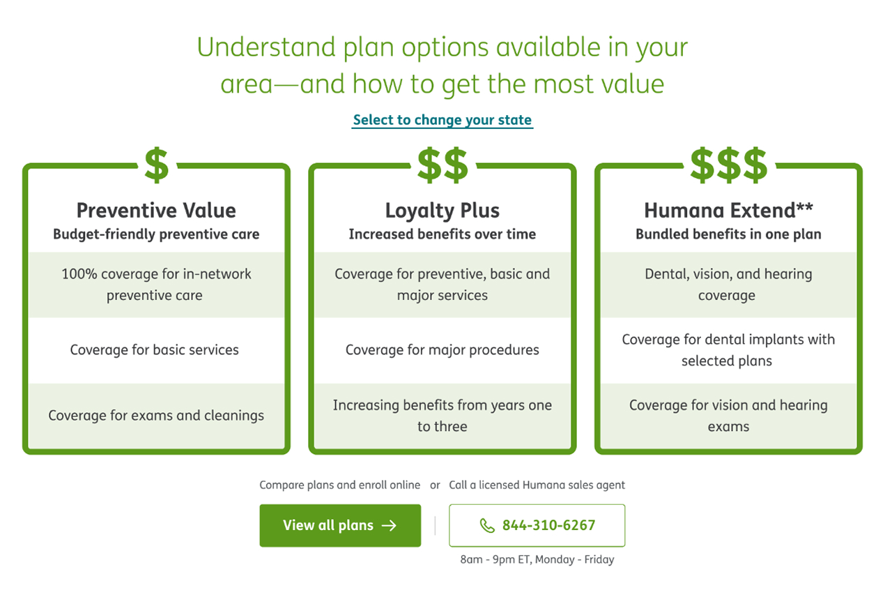
Following the hero, we created a module with three preloaded plans. The plans are specific to the customer’s location, ensuring they will never see a plan that is not available in their area.
Each plan is in a card that features scannable and comparable information and the cards are presented left to right in “Good, Better, Best” order.
We gave the customer just enough information to get an idea of what they may be looking for before entering the shopping experience.
scannable layout
comparable features on each plan are easily scannable
repeated call to action
reinforced the shopping funnel with second CTA placed after the plan cards
dynamic information
plan cards load dynamically based on customer’s location
At the end of the annual open enrollment period, we not only saw an increase in customers entering the shopping experience, but also an increase in dental plan purchases as additions to comprehensive medial insurance.
