Site Redesign | FreseniusKidneyCare.com
The Ask:
Revamp Fresenius Kidney Care’s current website with a focus on streamlining information delivery, simplifying the navigation, and fixing accessibility issues across the entire site in conjunction with a backend migration to a headless architecture.
As the lead designer on this project, I focused on usability issues that had been increasing the site’s bounce rate and lowering retention among the client’s 65+ year old target audience.
Client
Fresenius Kidney Care
Role
Lead UI/UX Designer
Timeline
Two Months
Year
2024
The original hover-activated fly-out navigation was not accessible and very difficult for Fresenius’s 65+ year old main demographic to use effectively. Many of the core pages were hidden under parents, and some pages weren’t in the navigation at all. We shifted to an intuitive mega menu design that simplified the navigation across all viewports.
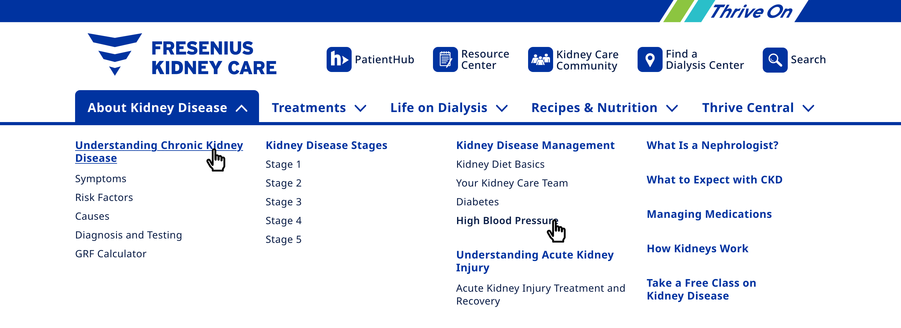

accessibility
text is high-contrast dark blue color on white background
organization
childless pages are organized together to help visibility
experience
activated navigation section is highlighted
usability
removed hover activation, all pages are shown with one click
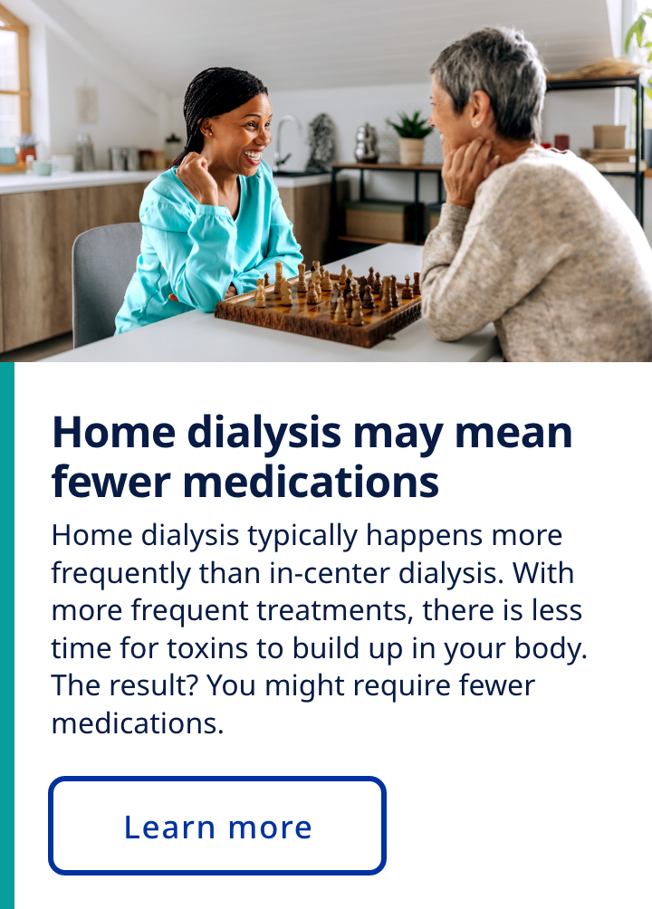
Without a component library or web style guide, the site became bloated with components designed for one time use, pages that used inaccessible colors, and brand elements that had since been replaced in print media. As part of the redesign, we replaced all existing components and built a scalable component library and web style guide with robust documentation.


timelines
built reusable components that reduce development time
responsive
designed components in multiple sizes and built them to scale with the viewport
deliverables
created page templates with established typefaces, colors, and typography
brand awareness
updated all components with new brand colors, icons, and photography
To increase accessibility and usability, we created multiple button styles, used colors strategically to divide content and direct the user’s eye across pages, and applied a mix of photos and icons.
The age of the target audience was our guiding star for every decision we made across the redesign. From small choices to more foundational changes like redesigning the navigation, we made very decision with the end user in mind.

